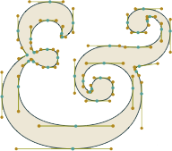
Designers usually try to use a font that stands out or fits particularly well into a given context. Well, what about an average font? What would that look like? A regular schlump of a font, a Joe Blow, a real nobody, neither dignified like Times New Roman nor stentorian like Helvetica, neither jovial and welcoming like Comic Sans nor exotic like Algerian. Well, someone did it. Check it out.
“I am not a type designer. This is the story of the creation of a new font, Avería: the average of all the fonts on my computer. The field of typography has long fascinated me, and I love playing with creative programming ideas, so it was perhaps inevitable that the idea came to me one day of “generative typography”. A Google on the subject brought up little, and I put the idea to the back of my mind until it occurred to me that perhaps the process of averaging, or interpolating, existing fonts might bring up interesting results. Luckily at this point I didn’t do any more web searching. Instead I grabbed my laptop and came up with an initial idea for finding what the average of all my fonts might look like, by overlaying each letter at low opacity. The results can be seen in the below image.”
Click on the image below to learn more about Averia: The Average Font.


No Comments