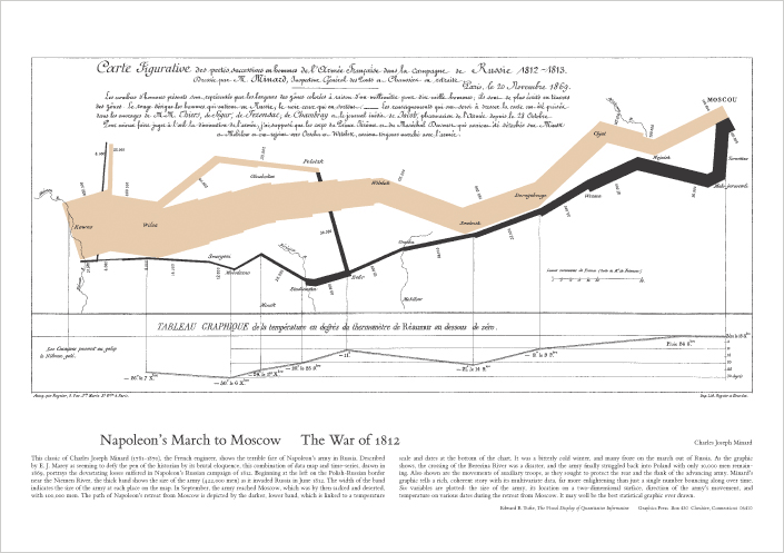
Probably the best statistical graphic ever drawn, this map by Charles Joseph Minard portrays the losses suffered by Napoleon’s army in the Russian campaign of 1812. Beginning at the Polish-Russian border, the thick band shows the size of the army at each position. The path of Napoleon’s retreat from Moscow in the bitterly cold winter is depicted by the dark lower band, which is tied to temperature and time scales.
Click on the graph below to purchase a copy.
online pharmacy buy anafranil no prescription with best prices today in the USA
online pharmacy purchase cozaar no prescription with best prices today in the USA


2 Comments
why were we talking about this at Monk’s that night? I can’t remember how it came up.
Because that’s always the kinda stuff we talk about when we drink in dark back-room bars with friends and loud music.